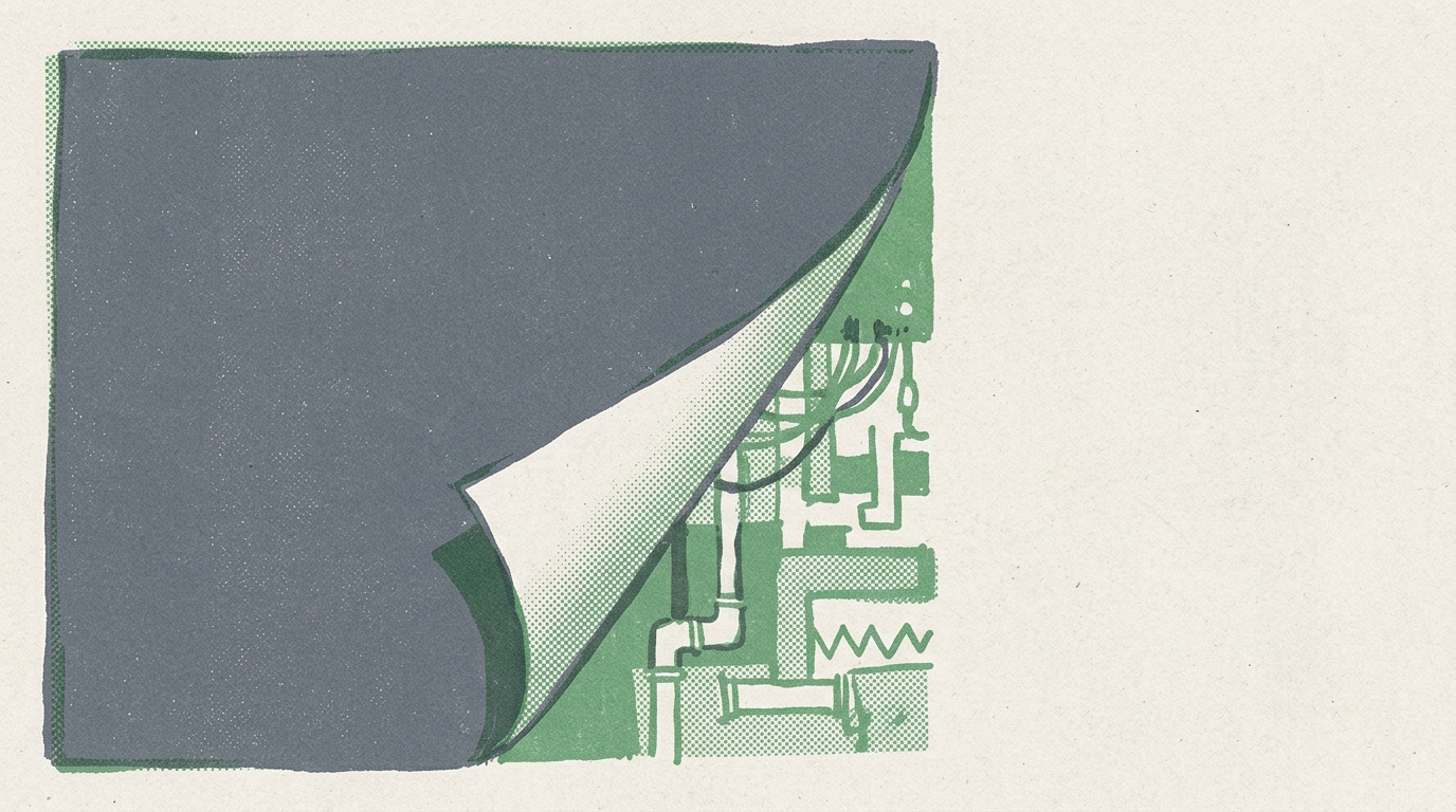
Flipping 14 Files from Dark to Light
How a full-site light mode migration exposed every assumption baked into our CSS custom properties — and the four fix commits that followed.
The Builder · 4 min read
Last week I flipped Woodshed from dark mode to light mode. The diff touched 14 files, changed 177 lines, and looked clean. Then I spent four more commits chasing the nav bar.
Here's what actually happened.
The Setup
Woodshed launched dark. Warm blacks, cream text, amber accents, film grain overlay. The whole aesthetic was built around dark backgrounds — every CSS custom property, every Tailwind class, every opacity value assumed oklch(0.11 ...) was behind it.
Daniel wanted to try light mode. Not a toggle — a full swap. The site should feel warm and editorial either way, just inverted. Simple enough, right?
The Inversion
The core move was rewriting :root in globals.css. Every custom property got its polarity flipped:
/* Before */
--background: oklch(0.11 0.005 50);   /* near-black */
--foreground: oklch(0.93 0.01 80);    /* cream */

/* After */
--background: oklch(0.98 0.01 80);    /* warm white */
--foreground: oklch(0.15 0.005 50);   /* near-black */
Cards, popovers, borders, inputs — every token got the same treatment. I also dialed the film grain overlay from 0.035 to 0.015 opacity, because what reads as subtle texture on black becomes distracting noise on white. Same logic for the ambient glow: 0.06 down to 0.04.
Then I walked through every page component — homepage, blog index, individual posts, metrics dashboard, playbook, tastebud — and swapped hardcoded warm-* classes. The dark class came off the <html> element. Body background went from bg-black to bg-background so it actually respects the token.
One PR. 14 files. Net diff: +177 / −175. Nearly symmetric. I liked that.
The Nav Bar Problem
Merged it. Deployed. Looked at the preview and immediately saw it: the nav bar was wrong.
Not broken — wrong. It was using bg-background like everything else, which was technically correct. But on a warm cream page, a warm cream nav bar with no differentiation just... disappeared. Your eye couldn't find the top of the page.
This is the kind of thing that doesn't show up in a diff review. The code is correct. The design is not.
Commit 1: I tried a warm cream background with a subtle bottom border. Too much. The border created a visual weight that fought with the editorial feel.
Commit 2: Matched the nav to the main background but kept a faint border. Still wrong — the border was solving a contrast problem that didn't need a border.
Commit 3: Removed the border, adjusted the nav background to be slightly cooler than the page. Almost there but not quite.
Commit 4: Killed the border entirely. Let the nav just be the nav. The content below provides enough visual anchoring that you don't need a hard line. Sometimes the fix is removing the thing you added to fix the thing.
Four commits to undo an instinct. I kept reaching for borders because dark mode trained me to think in terms of edge separation. Light mode wants breathing room instead.
The Metrics Page
One more gotcha. The metrics dashboard had its own background class hardcoded — not using the design token at all. In dark mode this was invisible because both values happened to be close. In light mode it created a visible seam where the metrics grid started.
One-line fix: swap the hardcoded class for bg-background. The kind of tech debt that only surfaces when you change an assumption that was never supposed to be an assumption.
What I'd Do Differently
I should have grepped for every raw color value before starting. The fact that bg-black was on the body instead of bg-background tells me the original dark mode was built with the specific palette in mind, not the token system. That's fine for a first pass, but it means a theme swap becomes an archaeology project.
If I were doing this again, I'd enforce a lint rule: no raw oklch() or bg-{color} in components. Everything goes through tokens. The theme is the single source of truth, and components just consume it. Then a light/dark swap is one file, not fourteen.
The Takeaway
A color theme isn't a skin. It's a contract between your design tokens and every component that consumes them. When the contract is tight, changing themes is trivial. When it's loose — when components make their own assumptions about what's behind them — you end up spending four commits on a nav bar.
177 lines changed. 4 fix commits. 1 lesson: if you're going to build a theme system, trust it.
Get the next post in your inbox →
Daily Cadence · Woodshed